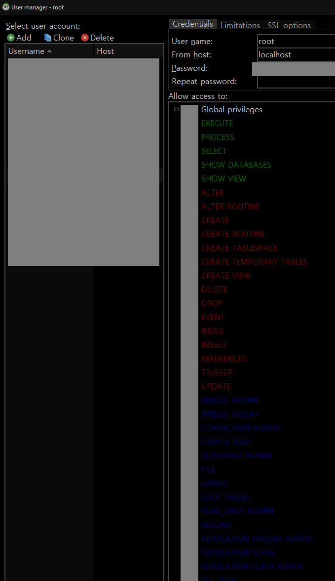
Using the "Windows10 Dark" theme the User Management window has very low contrast text for the third group of permissions. Please see the attachment. How can I fix this? The closest I can find is the SQL tab in the Preferences window.

- Home
- Downloads
- Images
- Forum
- 31 Mar - ansgar: After trying to change the font, a magic ...
- 28 Mar - ansgar: EAccessViolation
- 21 Mar - ansgar: Inverse table filter
- 20 Mar - ansgar: create ability to save export settings
- 12 Mar - KapibaraYT: Lost connection to server at 'h ...
- 11 Mar - ansgar: Add a tree config to tables pane, includ ...
- 11 Mar - fjm: View Definition Panel disappears
- 09 Mar - ansgar: Retrieving original view
- 04 Mar - ansgar: HeidiSQL & Linux
- 04 Mar - ansgar: Work in Linux
- 04 Mar - ansgar: Please make a linux version
- 28 Feb - ansgar: Compile with Lazarus
- 27 Feb - ansgar: Wildcard in Multi Column Filter?
- 26 Feb - Roberto: Deleting content when saving a modified ...
- 26 Feb - Kcko: Heidi closes immediately! :((((
- 24 Feb - skullsp: Groups in the project tree.
- 24 Feb - ansgar: Remove definer attribute
- 21 Feb - BerLech: Next Data field edit with Tab key
- 20 Feb - Kcko: Max width of hint
- 17 Feb - finbar: Heidi changes the collation on connectin ...
- Donate
- Bugtracker
- Help
